Amae
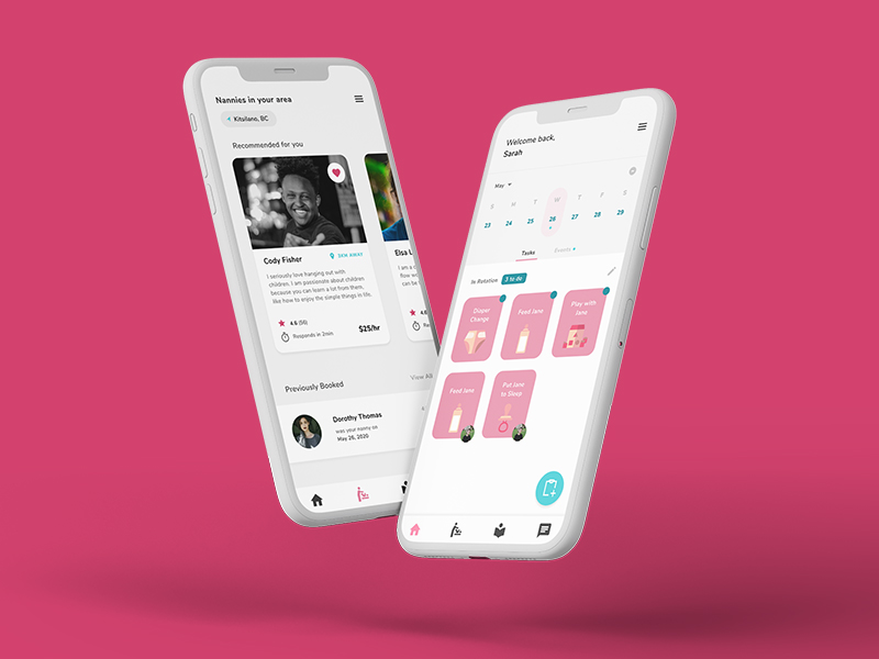
Amae is a utility app for busy parents. Amae helps parents to manage their time, learn about parenting and get help easily and quickly.

Type
UX / UI
Year
2020
Skills Applied
- UX / UI
- Figma
- Prototyping
- Project Management
Team
- Kaitlyn Andres
- Akshay Chawla
- Aditya Mawlankar
- Robert Michels
- Dawood Shafqat
The Task
This project was a design exercise to create a user interface mockup. It was created for an interface design course that focused on goal-oriented design. Consequently, a big part of the project was identifying user needs within a particular domain, and designing a product that helps the users achieve their goals.
Our domain was that of young parents. With our design, we tried to create an app that helps parents coordinate their parenting tasks, as well as get help easily and quickly when in need.
The Result
Dashboard
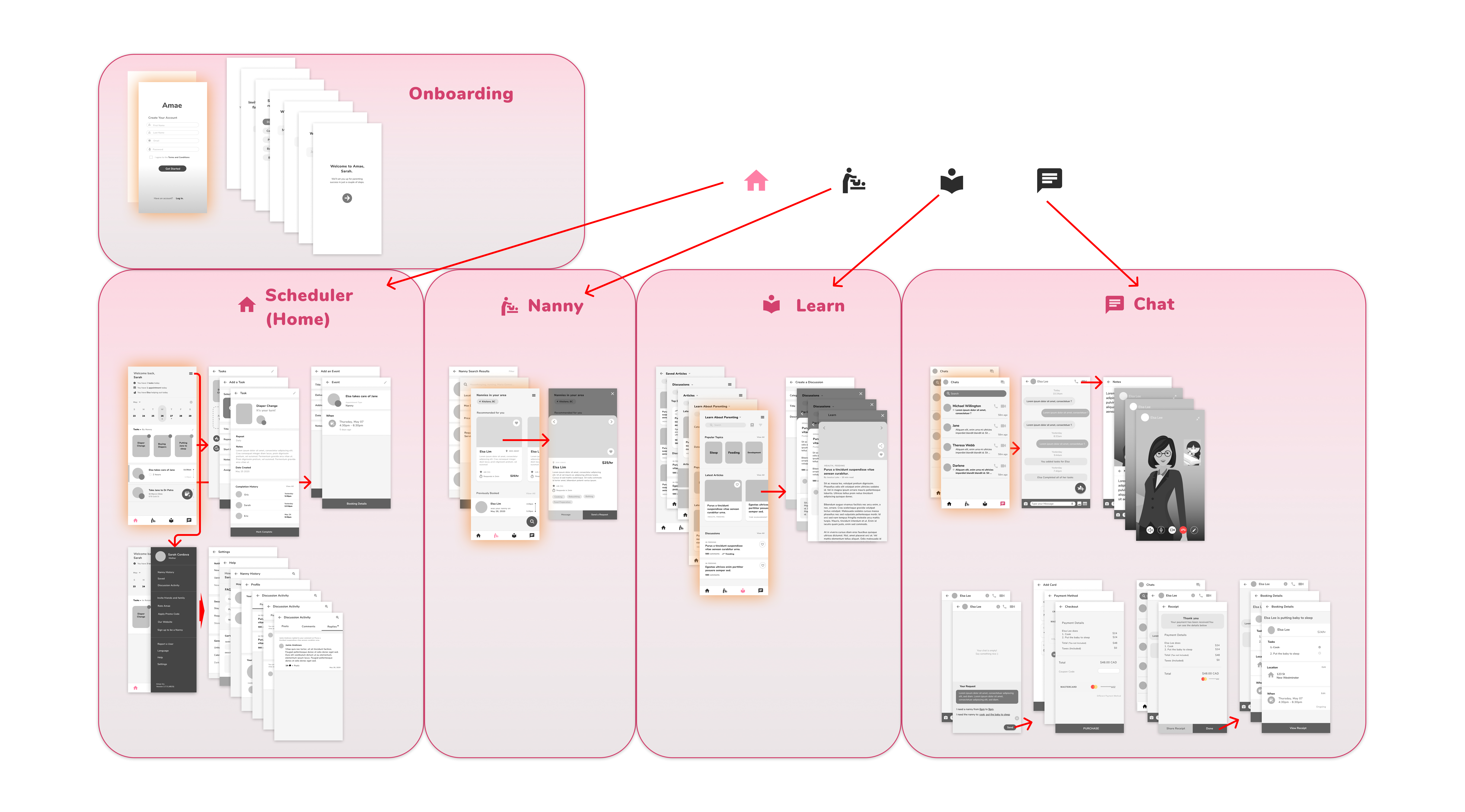
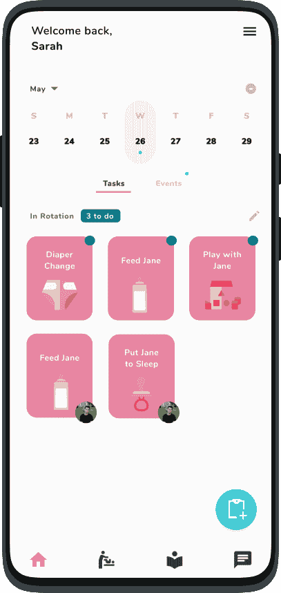
The dashboard helps parents with their most frequent tasks. Parents can coordinate recurring tasks, such as diaper changes, as well as scheduled events, such as doctor appointments.
Nanny
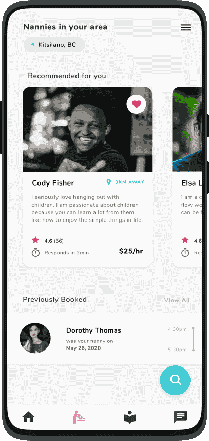
With the nanny feature, users can browse for and book nearby nannies. Their profiles show ratings and reviews, their skills, and more information. Users can also easily rebook previously booked nannies.
Learn
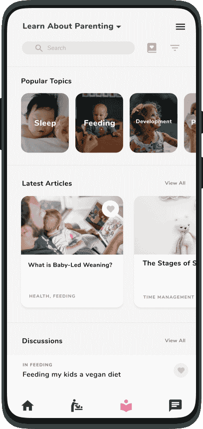
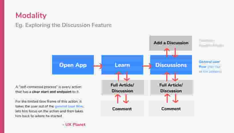
Learn features curated articles, relevant news as well as community discussions. This helps parents as well as nannies learn more about child-rearing and provides a parenting community to engage with.
Chat
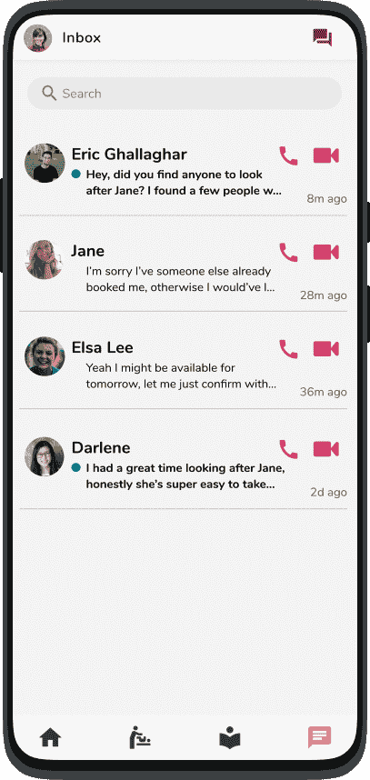
The chat feature doubles as an easy way to stay in touch with other caretakers, as well as a way to organize. Through chat, parents can assign tasks to each other, as well as book and manage an appointment with a nanny.
Process
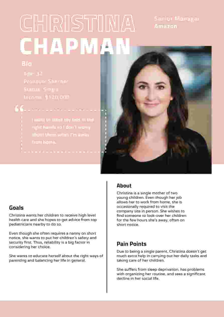
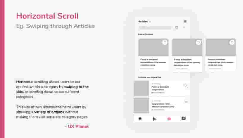
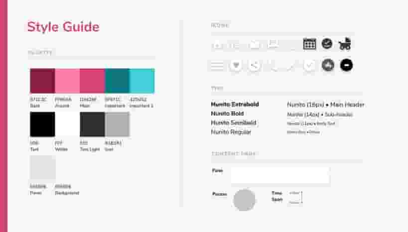
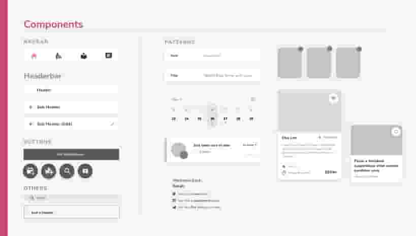
The project was developed in 4 months by a team of 5. I was the project manager, as well as one of the UX and UI designers. Our process began with brief domain brainstorming, followed by an ethnography study to better understand our users. After coming up with personas and multiple concept ideas, we focused on Amae. We then designed our product. For this, we designed many artifacts, such as flowcharts, wireframes, user journey maps, interaction patterns, and a style guide. In the last stages, we performed user testing and refinement. An outcome of this was that we dropped a health feature we had previously planned to include. Finally, we created a product website to present our final design.
Challenges
One of our core challenges throughout the design process was making the app safe. One of our solutions was the design of the nanny experience. Nannies can learn and get certified through the Learn feature. Their thorough profiles feature ratings, reviews, and skills, to allow parents to find the best nanny for their needs. Parents can see what tasks a nanny has completed, call them at any time, and report a nanny. These features aim to maximize transparency to create a safe experience.
Result & Design Artifacts
You can try the interactive mockup below, and take a look at the file itself. We got very positive feedback and were satisfied with our final result, the journey we took to get there, and the things we learned along the way.
Design Artifacts
Below are a selection of various design artifacts from this project. These represent many stages of our process, from researching our audience and their needs, to planning out UX flows and wireframes, to our final presentation of the mockup via a fictional product website, which was created in a 2 day sprint.
